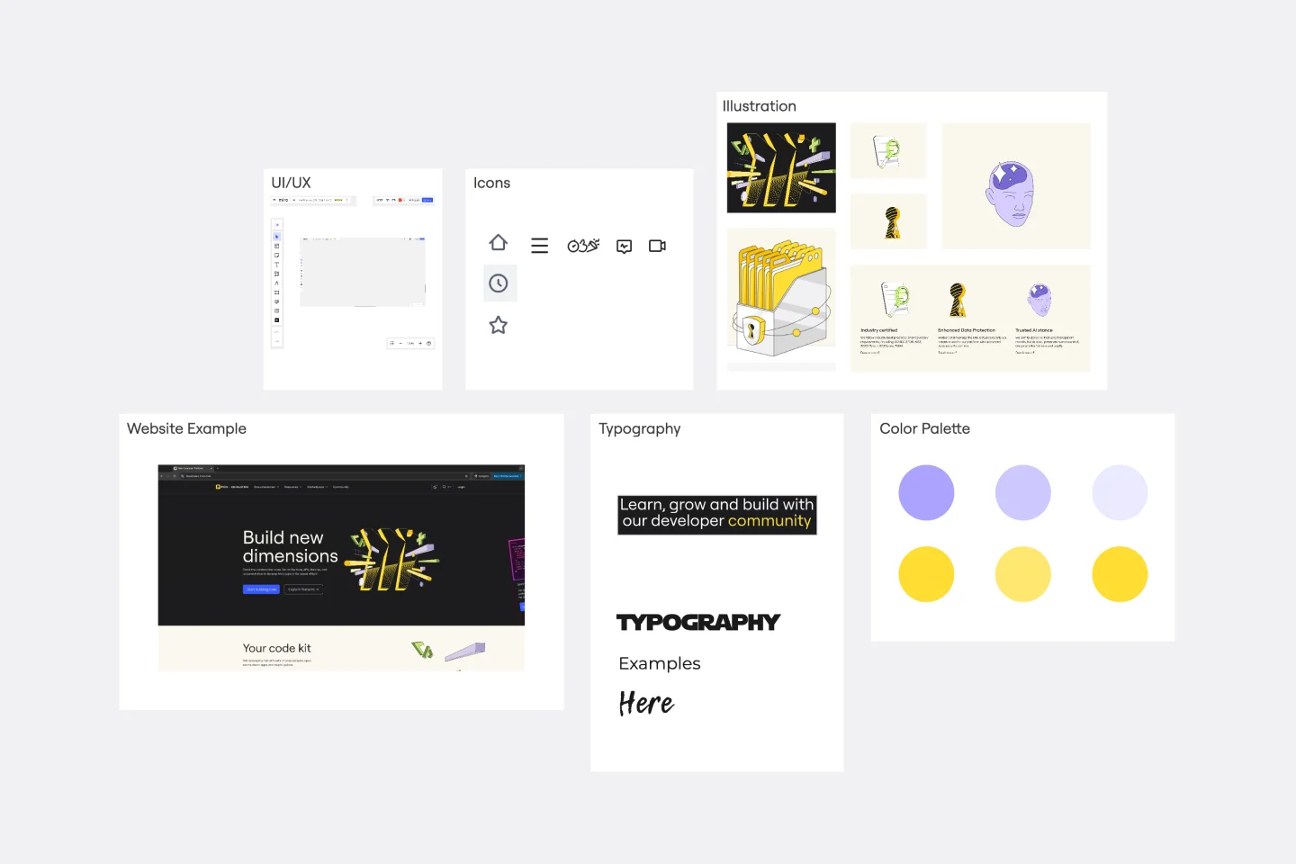
A friendly template for exploring, organizing, and sharing your color direction in one place.
Use this mood board to collect inspiration, build your primary and secondary palettes, test color combinations, and define simple do’s and don’ts for your design system. It’s a handy starting point for brand projects, product UI work, campaign visuals, or any design process where color decisions need to feel clear and intentional.
You can use it to:
Gather visual references and color inspiration
Define your main brand colors
Add secondary and accent colors
Test combinations for contrast, readability, and mood
Capture typography and color usage examples
Align your team on what works, and what to avoid
By the end, you’ll have a clean, practical color guide that makes it easier for everyone to design with confidence and stay visually consistent.